Landing Page Design: Boosting Presence and Engagement

Enhancing Visibility, Brand Awareness, and Leads

Overview

This project involved designing a personalized marketing landing page for Keller Williams (KW) realtor. The goal was to strengthen the broker's online presence, attract potential clients, and improve brand recognition. The project achieved a 20% increase in website traffic, a 14% rise in lead generation, and a 10% expansion of the client's customer base.

My Role

I worked closely with the client as a designer for the Keller Williams Broker's landing page design project. I researched Keller Williams Realty's brand, created the information architecture, sketched wireframes, designed the website using Webflow, and incorporated client feedback during the design and development process.

Problem Statement

KW Realtor's existing online presence wasn't attracting enough clients and needed improvement to enhance brand recognition.

Client

KW Agent

Timeline

1/12/2023 to 2/14/2023

Team

Client, Designer

ACTIVITIES

  • User Research
  • Wireframe
  • Design
  • Test
  • Integrate

Tools

Figjam
Adobe Photoshop
Midjourney
Figma
Blisk Browser Testing

Challenge

Defining the Problem

Revamping KW Realtor's Online Presence

KW broker lacked a strong online presence, hindering their ability to connect with potential clients. Key challenges included:

  • No personalized profile:This made it difficult to showcase unique selling points and build relationships with potential clients.

  • Low engagement rates: The existing website, while offering listings, lacked a personalized experience broker's profile and attention to convert visitors into leads.

Solution

Double Diamond Process

I used the double-diamond design process to work together with the client in creating a marketing landing page. The following are the main steps that I took in working collaboratively with the client:

Research and Discovery

In this phase, we conducted a detailed review of KW Realty's brand guidelines, visual research, and user research on the client's customer base. I created a mood board and style guide to help define the design's look and feel.
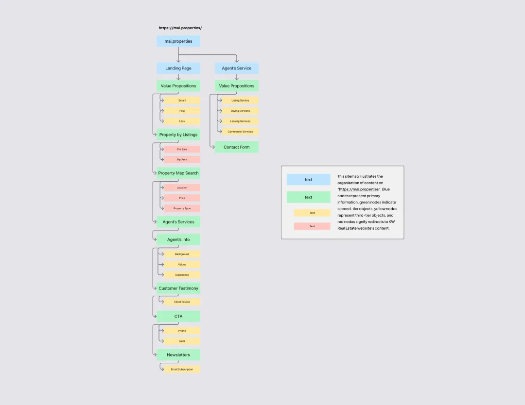
Information Architecture and Wireframing

I reviewed the research findings and gathered data. I created an information architecture diagram to organize the content and user navigation. Afterward, I converted the material into wireframes to ensure the layout and content placement were correct then presented it to the client for adjustments and feedback.

Figure 4. Whiteboard sketch, low-fidelity, and mid-fidelity wireframes.

Visual Design and Development

After finalizing the wireframes, I created a style guide for designing the landing page in Webflow utilizing the Client-First framework. This step included setting up the layout, adding content, and defining the visual elements like colors, fonts, images, animations, and responsive design.

Testing and Iteration

Throughout the design process, I conducted usability testing with the client to gather feedback and refine the design iteratively. This ensured a seamless user experience and addressed potential usability issues.
By employing an iterative approach and maintaining constant communication with the client, success was achieved with a landing page site that fulfilled the requirements of both the users and the business objectives.

Methodology

Research and Content Strategy

To inform the design decisions, I employed a combination of research methods:
  • Content evaluation:Assessed existing website content for clarity, conciseness, and user engagement.
  • User research:Conducted surveys, and interviewed home buyers to understand target audience needs, pain points, and expectations from a real estate landing page.
  • Collaboration with the client:Collaborated closely with the client to understand their target audience, brand messaging, and desired user experience goals.

Planning and Implementation

Based on the research findings, I developed a content strategy that focused on:
  • Information Architecture: Organized the landing page structure to address specific user needs and preferences.
  • Content Strategy: Created targeted content that addressed the pain points and expectations identified in the surveys.
  • Call-to-Action (CTA) Optimization: Designed CTAs aligned with the user's desired actions and motivations.
This research-driven approach ensured the content effectively supported the design and contributed to the overall success of the landing page.

Design Features

Streamlined Navigation to Property Search

Property search options were added using navigation links, directing users to search filters and property listings linked to KW Realtor's profile. This feature aims to give insight into user behavior and interactions.

Integrated Analytics and Capture Form

The landing page integrates analytics and a lead capture form, providing a valuable tool to analyze user behavior and enhance lead generation, gaining insights into user preferences. This will enable a data-driven approach for future iterations to generate more leads.

Results

The Impact

Captured Insights and Optimized Conversions

Through targeted marketing initiatives and social media promotions:

  • 20% increase in monthly site traffic
  • 14% improvement in lead generation
  • 10% expansion of the client's customer base

What I Learned

Efficient Communication and Collaboration

Maintaining consistent communication with the client was crucial. Regular discussions and feedback sessions ensured design concepts aligned with the client's vision, contributing significantly to a successful partnership.

Next Steps

Targeted Ad Campaigns

I recommend creating a focused ad campaign showcasing the services offered on the landing page and strategizing for future updates. This will boost site visibility and attract more potential customers.

Thank You!

I trust you found as much delight in observing this project as I did in crafting it.

Next Projects

UX/UI design project, QuantaCam 3D, a 3D AI generation concept app showcased on mobile mockup devices, featuring 3D designer screens, voice input screen and main logo loading screen.
Case Study

QuantaCam 3D

AI-driven 3D Modeling

UX and UI Design

 iPhone and desktop mockup devices for UX/UI Design project, showcasing Wagamama's customized Ramen ordering for take-out. Includes images of topping and protein selection process.
Case Study

Wagamama

Custom Ramen Order

UX and UI Design